Rock 'n Poll - a visualization meant for the patient
Rock 'n Poll is a data visualization piece by Maarten Lambrechts, a data journalist from Belgium. Through an interactive and stepped story, the visualization explains the role chance and randomness play in polling results. It demonstrates the relationship between the increased number of people voting and accuracy of the polling results.1 The methodology of visualizing data takes inspiration from the Monte Carlo method which uses computational algorithms relying on repeated sampling to obtain numerical results. Hence only the rules for the algorithms are defined generating different hypothetical data every time the user scans through the visualization. However, the algorithm also has rules that set limits while generating data, for example, the first sampling of 10 people always results in the Red party winning.
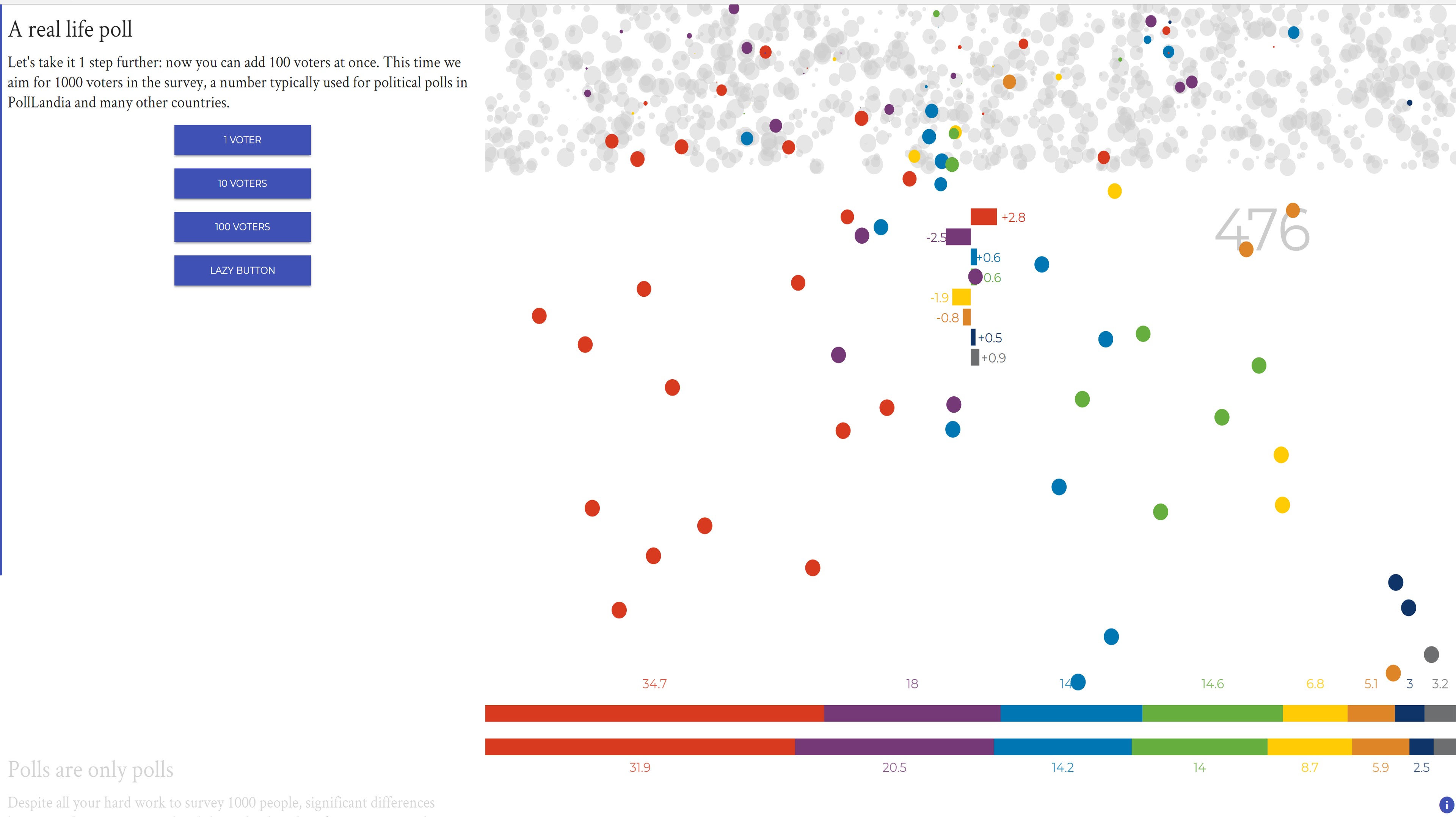
This piece uses an imaginary country 'PollLand' with a population of 1 million and eight political parties, each named after a color, to tell a story about how polling works. The story and supporting visuals both help to follow the flow of things and keep the user engaged. The story gradually unfolds helping the audience to grasp the effect of each vote, for example, the piece starts with a voter set of 10 people and slowly takes it to a sample of 1000 people. The design layout of this visualization is divided into two parts - one which moves like a scroll and the other where the elements change and move within it. The first part has descriptions to interpret the visualization and the latter showcases the visualization. This works well, reinstating one of Edward Tufte's visual display principle - "for graphics in exploratory data analysis, words should tell the viewer how to read the design and not what to read in terms of content".2 On the other hand, if one loses track of a single step, it probably becomes difficult to follow the story since there are no titles next to the visuals. Here, it becomes important to emphasize Tufte's principles on graphical integrity, and the importance of labeling and mixing graphic and text.3
The interactivity and its corresponding animation work well, for example, pressing the '1 voter' button deploys a circle from the bank of circles on the top to the count of votes at the bottom, as if mimicking the act of dropping a vote in a ballot. The interface allows the user both to add one vote at a time, emphasizing the weight of each vote and the effect it can have on the overall outcome of polling results, and multiple votes in a single click aptly called the 'lazy button'. When adding multiple votes to the total count, multiple circles start falling from the top and every falling circle changes the bar lengths showing the difference between actual polling results and the survey results. Changing lengths of the bars along with the rise and drop of the 'difference number' helps to understand that something is being counted and re-emphasizes the weight of each vote.
The colors used to represent political parties are visually striking and complimenting, however, they are not color blind friendly. The pairing of colors like blue and green, blue and purple, and light green and yellow in the visualization makes it hard for color blind people to comprehend the difference and follow the story of the visualization easily.4 Another graphical principle by Tufte states "The representation of numbers, as physically measured on the surface of the graphic itself, should be directly proportional to the numerical quantities represented."3 In this piece, each circle is claimed to represent 1000 Pollandians and even though using different sizes of circles looks visually more aesthetic, it is confusing to vary the diameter of the circles and let the values be the same. Also, at the beginning one circle is supposed to represent 1000 PollLandians, while in the very next step one circle starts representing one PollLandian - this is a little disorienting.
As one reads the first paragraph, it's a little confusing how you move forward. The infographic for the 'next button' - a tick mark - does not seem very intuitive. It has limited interactive-ness, in the sense that it directs the user forward in a linear manner. There is no way to go back a step or relook at a previous part of the story. The story moves in a cyclic and unidirectional manner. A timeline that allows one to see what part of the stepped story one is at and also jump to any part of the story by clicking on it would have been helpful. Right now, to look at the last page of resources or any part of the story in-between, one needs to go through the entire cycle of clicking ticks (next) to reach the end.
The end seems to be the most ambiguous part of the visualization. Even though the piece uses simple visuals to explain the randomness, one gets lost at the end. The piece claims to not use any statistical formulas to explain the theory of randomness in polling, however, the last line "4 times the deviation was greater than 2 percentage points, the largest difference was 3.8 percentage point" requires at least intermediate knowledge of statistics. Another vague statement is the conducting of "8 polls at exactly the same moment, with exactly the same number of surveyed people, with the same method and among the same group of people." No detail is given as to why 8 polls from the same set of people result in drastically different results?
After the visualization has made the point about chance in polling results, one is left wanting to see more. Maybe, a comparison between real-life pre-polling survey results and polling results with actual names of political parties could have been a good way to bridge the gap between a hypothetical situation and reality. All in all rock n' poll is a visually stimulating piece with a good narrative, but with the restricted linear movement and some ambiguous graphics and text, it definitely is not for someone in a hurry or with low patience.
Here is a link to rock 'n poll. Enjoy!